Friday, May 4, 2012

Typography

(Before)

(After)
This assignment involved creating a visual out of words.  The words that you used had to represent the visual you were creating.  I decided to use a tree as my visual.  I used a simple picture of a tree as a basic outline as to where to place the words and how to create the image.  The words that I chose were "grow" and "branch."  When I think of a tree both of these words come to mind.  Throughout the visual, I varied the size of the font, curvature of each word, and angle.  The typography was kept to simple black and white colors.  I believe that my final visual of the tree represents clarity.  The words used, clearly convey a tree.  By using different sizes of the font, depth becomes present and also helps represent the different bumps and clusters in the leaves of the tree and sizes of the branches.  The audience that my visual would appeal to is child or adolescent.  The different sizes of the font and arcs used throughout create somewhat of a playful environment.  There was no specific audience stated when the assignment was presented and in the end, the final visual could be used with almost any audience.  Finally, the purpose of this assignment was to use typography in unique ways.  I believe that I definitely fulfilled this purpose by using creative words to represent such a simple visual.  

Thursday, April 19, 2012

HARTS Visuals

This assignment required designing visuals for HARTS.  We created several visuals to be hung up around the site.  We decided to keep to the color scheme of blue and orange.  Using the same colors allowed for a sense of cohesiveness throughout the signage and floor plans.  We also used the same font throughout.  The first visual above is the kitchen floor plan.  The bright colors and key allow for easy access to various elements throughout the kitchen.  The colors work well with each other and stay in the color scheme that is used throughout the visuals.


This visual is a simple sign that will be hung in the kitchen.  It clearly states the chores needed by the volunteers.  Staying within the color scheme, the blue font pops off the orange background.  


This visual is of the floor plan of the location.  It simply states where each room is.  This will be a sign that will be helpful to the volunteers to know how to go about the HARTS location.


This visual is for the guests who come to HARTS.  It clearly states the smoke breaks and what to do when they occur.  The colors stay in the scheme.  The bold blue and orange boxes allow for the text to pop off the sign.  The small image of the cigarette adds a simple touch to the sign.  


These two visuals above are very helpful for the volunteers and guests.  The orange words allow for the targeted people to be aware of where to go.  The text is aligned center and pops off the sign.  


This visual will be placed next to the downstairs bathroom indicating that the showers are upstairs.  It is a simple, but clear visual that ties in with the rest of the signs.  I like the different hues of blue used throughout the visual and the orange catches the viewers eye.


This visual states the instructions for the coffee maker.  The lines clearly indicate the buttons that need to be pushed when making coffee.  The instructions are clearly stated in a light blue but also pop off the subtle orange background.  The pictures are also clear and a useful visual to the volunteers.


This last visual is a simple sign for the time schedule.  It is a simple visual that boldly states the times.  The color of the text is cohesive with the rest of the visuals to tie everything in. 


This assignment definitely has clarity.  Each individual poster clearly conveys its message while still relating to every other poster.  The cohesiveness of the colors and text allows for the posters to convey clear messages.  The audience for these visuals are the volunteers and guests at the HARTS location.  Each poster is eye-catching but sophisticated at the same time.  Finally, the purpose of this assignment was to create posters that will be placed at a local HARTS location.  The posters have to help aid the guests and volunteers while attending HARTS.  The posters we created definitely state directions and rules clearly and cohesively. 

Tuesday, April 10, 2012

Color


This assignment called for experimenting with color.  The primary colors are red, yellow, and blue.  They each complement with other colors (across form each other on the color wheel).  The first two visuals are the same, but the colors are alternated.  This also experimented with color trends.  Applying different colors to the same image can have a tremendous effect on its presentation.  The first visual is an example of complementary colors.  The big image is blue and the smaller staircase and writing is orange.  I like these two colors together.  They work well and form an eye-catching image.  The blue that I used is bright and light.  The saturation is pretty intense, almost fully saturated.  The orange is more rich and a bit darker.  The second image uses somewhat of tertiary colors.  The blue and grey colors are not exactly next to each other on the color wheel, but they also work well together.  I believe that the first image stands out more and the second is more muted.  I like both but they just vary in hues and saturations.  These visuals were also created in Photoshop using the CMYK color mode.  CMYK colors are achieved through the mixing of process color inks as they are applied to paper.  The next two visuals mainly use primary colors.  The third visual uses all three primary colors (red, yellow, and blue) and they work really well together.  They are eye catching and bright-high intensity and almost fully saturated.  The sign is simple but very appealing.  The last visual is my favorite.  I really like the different combinations of yellow, blue, and white.  It is very eye catching, once again using mainly primary colors.  The bright blue and yellow boxes make the white text pop off the page.  The colors used also work well with the image of the cigarette.  The sign is very simple but I like all the attributions displayed throughout.  The placement and alignment of text work well with each element on the page to create one cohesive visual.  

Competency Icons/Poster

For this activity, we had to design icons that described the 11 competencies for the College of Education.  The icons then had to be displayed on a poster in a creative way.  We wanted to keep a constant theme throughout so we decided to make each icon the same shade of blue, this would create homogeneity.  The icons also had to be simple but portray the message of each competency.  We came up with the idea of using a brain as our main visual and then relating each icon to the part of the brain that corresponds with.  We did this by color-coating the brain with the boarder of each icon.  The colors that we incorporated are bright and playful which target the younger age.  The pictures/visuals that are used for each icon are also child-like.  By making each icon the same size, shape, and color an element of consistency was displayed throughout and it is easily distinguishable that each icon belongs with one another.  Connotation is a big component of this assignment.  I believe that we did a pretty good job at representing each competency through a simple, square image.  One attribute that I maybe would have changed was the blue color used for each icon.  We decided to go with blue because the College of Education flag is blue and white.  I would have liked to use a color that would have popped more.  The border of bright color around each icon definitely made them unique but overall, if changes were made, I would alter the color.  The placement of each icon on the poster seems to fit well.  I believe that the poster may have looked better with less writing.  It was almost too crowded, but I do really like the end result.      

Special Topics Presentation


The special topic that I was a part of was Data Visualization.  Data visualization is all about visualizing information to see the patterns and connections that matter.  Through space, alignment, typography, and grids, complex information becomes easier to understand.  The three visuals that are shown above were part of the special topics presentation.  We made our project with Prezi, which is a data visualization program in itself.  The first visual presented above, I created using Microsoft Excel.  It represents JMU Tuition and Fees in an organized and color coordinated manner.  Overall, the visual represents the changes in tuition between in-state and out-of-state students from year to year.  The next two visuals were found online.  They are more complex visuals and professionally done.  The second visualization is a form of mapping which "maps" your twitter friends in the regions and states that they are from.  The last visual exerts a lot of information, but when enlarged, is quite easy to read.  The color coordinated lines, icons, shapes, and text help simplify information and facts.  There are many forms of data visualization.  Some are more complex then others, but they all help decode complexity.  The full presentation can be found at http://prezi.com/05ptvdknxhln/visual-literacy-data-visualization/ 

Tuesday, March 13, 2012

Practice with Photoshop Color Shapes

This assignment called for experimenting with color, style, and texture in Photoshop.  We could choose what shapes we wanted to experiment with.  The first element I tested was style.  I used the thumbtack shape.  The original color was a bright pink.  I then experimented with the "style" button in Photoshop and thought that the rainbow wash was a unique touch.  The next element I experimented with was color.  I started with a yellow flower and then transitioned into a bright green.  I think both colors looked appealing and exerted a playful/young feeling.  The last element was texture.  This is probably my least favorite visual out of the three.  My original lightening bolt was a light/muted pink color.  The lightening bolt after I added texture was a bit brighter and had depth.  I think that it would have looked more appealing if I had chose a different, more brighter color.  I do think that the light pink exemplifies the "texture" element well.  I am satisfied with the connotation of the visuals-they clearly represent the different elements.  Like I said previously, I am satisfied with most of the attributes such as color and presentation but some colors could have been brighter.   

Gestalt


The main idea of Gestalt is "the whole is greater than the sum of the parts."  The first principle examined is closure.  Gestalt believed that in closure, we attach meaning to visual displays.  To exemplify closure, I used the diamond shape to create what either could be one large diamond or an "x."  When you first look at the visual, it looks like 4 small, black diamonds that are arranged in a way to form one large diamond. After looking at the visual for a few seconds, the "x" begins to appear.  All of the diamonds (the whole) form an "x" which is greater than the parts.  The next principle is proximity.  Gestalt believed that we group things that are physically close to one another, in a meaningful way.  To exemplify proximity, I used the cross symbol.  I arranged the objects in straight lines in one visual and diagonal lines in the second visual.  each represent proximity, but the shapes are just arranged differently.  The third principle is similarity.  Gestalt believed that in similarity, we group similar objects together in a meaningful way.  I represented this principle by using two different star shapes.  Each shape alternated with one another, creating a pattern but are grouped together meaningfully.  The last principle is continuity.  Gestalt believed that in continuity, we look for unity in objects.  I used the heart and arrow shape to exemplify continuity.  It looks like the arrow is split by the heart, but when you look at the whole picture, the visual comes together.  Each visual was done using black and white which allowed for conformity, unity, and simplicity.  I believe that it was a good idea to keep the colors neutral to clearly display the 4 principles.  I believe that there is strong connotation throughout my visuals-everything is working toward the same goal of "the whole is greater than the sum of the parts."    

Monday, February 27, 2012

Alignment Activity

This activity focused on alignment.  We were given an image from our textbook, and had to replicate it.  I decided to create my visual in Powerpoint.  The color-blocked column on the right, is executing the idea of "alignment to the left."  Each box on the left also has a cupcake which is centered.  The text that is present is somewhat centered in the middle of the visual, but also "aligned left."  It is common for text to be aligned to the left.  It is how we write in the US, this paragraph about the visual above is also aligned to the left. The only text that we had to have actual words for was the title (Homemade Delicious Cupcakes) and the company name in the bottom right (Turner&Holmes).  All other text was created using "lorem ipsum" also known as "dummy text."  They are various fonts used throughout, but I think they work well together.  The smaller text is typed in a serif font, which the larger, bolded words are sans serif.  I decided to keep the color scheme constant from the original image to the visual that I created.  I did like the colors that were used, I felt like they popped off the page and caught viewers attention.  The different angles of the cupcakes were created by using the rotation tool in Powerpoint.  Overall, I like how this image turned out.  It is a pretty good replication of the original image and I think each element is aligned well.

Thursday, February 23, 2012

Emphasis

Before

After

This activity entailed finding an image and then adding emphasis to a certain element in the picture.  The main idea of emphasis is to create visual hierarchy or a dominance of certain items.  the original picture of the piano (above) is a simple black and white.  The idea that I had was to create emphasis on the keys.  I played with the hue and saturation parts of Photoshop.  I ended up creating an "emphasis on color" through the keys on the piano.  They have a blue and purple value from the hue, it creates a unique image.  It is not common to see keys on a piano that are not white.  By creating this contrast in color between the keys and the black background, emphasis is definitely a key element in "after" picture.

Wednesday, February 22, 2012

Repetition and Visual Echo

Overall, this activity was focused around the idea of harmony.  Harmony means agreement.  With visual harmony, there is agreement between elements, it is used to enhance themes.  In the visual that I created above, I used repetition and visual echo to establish harmony.  Repetition as a focal image was used throughout.  The same flower pot, watering can, arrows, and color scheme was present.  Next, I used visual echo.  Visual echo creates an "eye-pleasing sense of unity between elements of layout."  I used two types of visual echo- echo through color and echo through style.  There is a basic color scheme of black and white throughout the images in the foreground and the transparent image of the flower in the background matches the text.  The style of the visual is a constant "sketchbook" or hand drawn look.  This visual that I created conveys the message of harmony through steps of repetition and visual echo.  

Thursday, February 16, 2012

Grouping Challenge


Before
After

This challenge asked to create a poster centered around a word that describes "you."  To be honest, it was probably my least favorite activity-it was not easy at all.  The visuals and words throughout the poster should represent the word that you are trying to convey.  The word that I chose was not as easy as I thought; its such a simple characteristic but difficult to visually represent.  There are not many clues but if you analyze the colors, words, and pictures you may be able to guess the word that I chose...?
Part of our task was to create a poster off of grouping.  When objects are grouped, connections are made between elements.  I tried to group the text together-making all of the font the same color and style.  There is also a sense of grouping among the colors throughout the poster.  Soft, calming tones of blue and green are used.  Adding a soft edge around the "keep calm and carry on" also conveyed the message of calm.  
After we presented our posters in class, I decided to change a few things around based on suggestions that I received.  I made each picture a little less transparent and split the background between two images instead of one.  One of the suggestions that I really liked was to make the words look like they are going with the shape of the palm tree.  I thought that added a nice touch and made it unique.  I stayed with the same color scheme but made the yellows a bit softer.  Overall, I like my second poster a lot better than the first even though only a few changes were made.

Wednesday, February 15, 2012

Grouping Activity

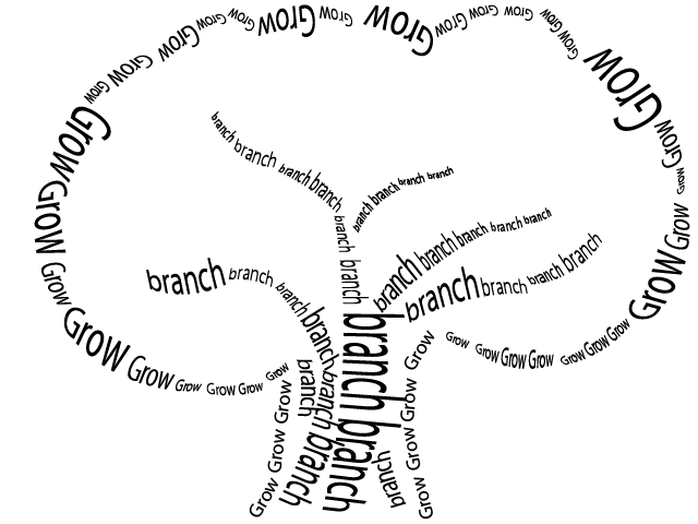
This assignment consisted of words and how you would represent each visually.  We were given seven words and told to use the "basic shapes" in Powerpoint to exemplify each.  
When the word "unity" was mentioned, I immediately thought of a circle.  Personally, a circle represents togetherness and completeness.  Because we had to use ten of the same shape in our visual, I decided to make one big circle out of ten smaller ones.  I liked the idea of having the colors fade into one another.  It made them all interconnected.  Part of the definition of "unity" is combining all its parts into one.  I believe that the representation that I created expresses what "unity" means quite clearly.

Celebration, to me, triggers bright colors, confetti, happiness, and fun.  By using a "star basic shape" I tried to convey this message.  I focussed on using bright colors and experimented with the 3-D tool/size of each shape to make the "confetti" look like they were falling.  

When I came across the "no" symbol (what it is called on Powerpoint), I thought of isolation.  Being closed off or not being allowed to do something.  Another aspect of isolation is complete separation from others.  I portrayed this message by enlarging and putting emphasis on one of the "no" symbols and the other nine were smaller and not as bright; They were also in the shape of an "x" which I thought represented isolation.  I chose the color red because it implied danger and seemed to be appropriate for the word.  The glow affect around the large red "no" symbol also made it stand out and have depth.     

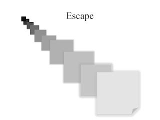
I chose the "folded corner" shape for escape because it looked like something was trying to come out from behind the object.  I started with black and as the objects got larger, the colors also got lighter-trying to imply that there is "light at the end of the tunnel."  There was a bit of "glow" added to the 5 largest shapes to add emphasis.  I believe that the visual that I created represents the journey of something or someone trying to escape.

When I saw the lightening bolt shape, it triggered intimidation.  When something is intimidating, it brings fear, which is what lightening also represents.  The color scheme that I chose was dark and gloomy.  When something is intimidating, the mood is not light and happy.

Personally, this was the hardest word to represent visually.  I originally chose the "+" shape but then when I started to think about the word, I thought of the "thought bubble."  When something is logical, it involves thinking and it usually "all makes sense."  Sometimes logic involves many thoughts being processed together to bring about one "logical" answer.  The color scheme I stuck with was blue.  By making the large thought bubble a light shade, the smaller bubbles popped as they were filled with brighter and darker blues.   
To represent anarchy, I used the arrow shape.  I rotated each arrow different degrees so they were all facing various directions.  Anarchy implies chaos and disorder.  By having the arrows face all different ways, I wanted to create the message disorganization.  I also used different shades of orange and brown throughout the visual.  Some of the arrows started to fade from light to dark which I thought was a cool touch, especially for the along then bend.


Tuesday, January 31, 2012

"About Me" Poster


This activity involved creating a poster that represented "you" using Photoshop.  I am personally not the best when it comes to creating things in Photoshop.  I have some basic knowledge, but I would love to acquire more.  To start my poster, I began with the image of Long Island.  I used the selection tool to choose the parts of the picture that I wanted.  Originally, there was water surrounding the island, but I decided to only use the land part.  I also added a bit of softness to the edges by using the feathering tool.  After playing around with the "island" I decided to make that the focal point of my poster and add smaller images around it.  Because Long Island is my home, it does make up a huge part of who I am.  I decided to include the image of the state of Virginia because it has been a second home to me for the past three years.  Obviously an icon representing JMU was necessary!  The next image, the beach, is a big part of me too.  I work at the beach and live very close to it so it plays a big role in my life.  Lastly, the "I Love NY" sign, speaks for itself!  I included my name by using the text tool on Photoshop.  This poster was created with very basic skills of Photoshop.  I would have liked to included a few more details or experiment with different tools, but overall, the poster definitely represents who I am.   


Thursday, January 19, 2012

Principles of Visual Design

Before

After

Visual Design 1: This design entailed grouping, coloring, and rotating shapes into our own creative graphic.  At first, all of the shapes were randomly scattered and set at a basic color (green).  I added the "glow" effect to each shape to give them a bit more dimension and changed the colors to be more appealing.  I feel like these colors "pop" when you look at the shapes.  When rotating the objects, I was not sure what direction would look best for each shape so I decided to play around with it and eventually come up with the design above.  I believe that the end result is an interesting, unique design.   

Before


After

Visual Design 2: This design entailed making a poster.  We were given a basic outline (seen above "before").  The only object that we were given was the watering can, everything else we had to name ourselves.  I chose a simple title "Garden Sale" to go with the picture.  Making the font bold allowed for an eye-popping title. I decided to keep the color scheme simple, black and white.  I did not want there to be too much going on on the poster.  The location and website are also clearly indicated on the poster.  By simply rearranging the picture, lines, and words, a balanced, appealing poster was created.  

Tuesday, January 17, 2012

Research Design Arbitrary Graphic


    The instructions for this assignment were pretty simple: "A researcher is asked to create a visual that depicts her research design.  The design includes strategies, data collection methods and a sequenced timeline.  Using just PowerPoint, create a visual that depicts each of these elements as indicated." 
    This was the first visual the we designed in class.  Everyone was on their own, just create what comes to mind.  I knew there had to be eight separate stages of the visual because the study was composed of eight steps.  I personally took the approach of using pictures to describe the study.  If one were to look at the graphic that I designed, they may say that I targeted a young or child-like audience.  I believe because of the clip art that I used to describe the study, it does primarily focus on a younger audience but with the small amount of words used, it may be hard for kids to understand.  I could see teachers using this graphic in their classroom to help their students learn.  It also includes a variety of bright, eye-catching colors.  The arrows are bold enough where they clearly indicate the sequence of events.  I tried to use the same pictures to convey similar messages, for example, the students were always portrayed by the image of the boy sitting at his desk.  One of the main goals that I focused on was to use as few words as possible.  I wanted the art to communicate the study to the audience.  
    This assignment was challenging at first, because I had never participated in an activity similar to this.  Once I started and got a few ideas down, I began to enjoy it and really focus on what graphics would work best to execute the final product.  Not only did this activity allow me to become more familiar with aspects of PowerPoint, it made me realize how much you could do with basic software.  I look forward to creating more visuals.