
(Before)
(After)
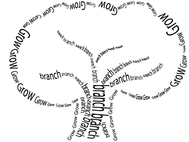
This assignment involved creating a visual out of words. The words that you used had to represent the visual you were creating. I decided to use a tree as my visual. I used a simple picture of a tree as a basic outline as to where to place the words and how to create the image. The words that I chose were "grow" and "branch." When I think of a tree both of these words come to mind. Throughout the visual, I varied the size of the font, curvature of each word, and angle. The typography was kept to simple black and white colors. I believe that my final visual of the tree represents clarity. The words used, clearly convey a tree. By using different sizes of the font, depth becomes present and also helps represent the different bumps and clusters in the leaves of the tree and sizes of the branches. The audience that my visual would appeal to is child or adolescent. The different sizes of the font and arcs used throughout create somewhat of a playful environment. There was no specific audience stated when the assignment was presented and in the end, the final visual could be used with almost any audience. Finally, the purpose of this assignment was to use typography in unique ways. I believe that I definitely fulfilled this purpose by using creative words to represent such a simple visual.
No comments:
Post a Comment