This assignment consisted of words and how you would represent each visually. We were given seven words and told to use the "basic shapes" in Powerpoint to exemplify each.
When the word "unity" was mentioned, I immediately thought of a circle. Personally, a circle represents togetherness and completeness. Because we had to use ten of the same shape in our visual, I decided to make one big circle out of ten smaller ones. I liked the idea of having the colors fade into one another. It made them all interconnected. Part of the definition of "unity" is combining all its parts into one. I believe that the representation that I created expresses what "unity" means quite clearly.
Celebration, to me, triggers bright colors, confetti, happiness, and fun. By using a "star basic shape" I tried to convey this message. I focussed on using bright colors and experimented with the 3-D tool/size of each shape to make the "confetti" look like they were falling.
When I came across the "no" symbol (what it is called on Powerpoint), I thought of isolation. Being closed off or not being allowed to do something. Another aspect of isolation is complete separation from others. I portrayed this message by enlarging and putting emphasis on one of the "no" symbols and the other nine were smaller and not as bright; They were also in the shape of an "x" which I thought represented isolation. I chose the color red because it implied danger and seemed to be appropriate for the word. The glow affect around the large red "no" symbol also made it stand out and have depth.
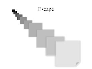
I chose the "folded corner" shape for escape because it looked like something was trying to come out from behind the object. I started with black and as the objects got larger, the colors also got lighter-trying to imply that there is "light at the end of the tunnel." There was a bit of "glow" added to the 5 largest shapes to add emphasis. I believe that the visual that I created represents the journey of something or someone trying to escape.
When I saw the lightening bolt shape, it triggered intimidation. When something is intimidating, it brings fear, which is what lightening also represents. The color scheme that I chose was dark and gloomy. When something is intimidating, the mood is not light and happy.
Personally, this was the hardest word to represent visually. I originally chose the "+" shape but then when I started to think about the word, I thought of the "thought bubble." When something is logical, it involves thinking and it usually "all makes sense." Sometimes logic involves many thoughts being processed together to bring about one "logical" answer. The color scheme I stuck with was blue. By making the large thought bubble a light shade, the smaller bubbles popped as they were filled with brighter and darker blues.
To represent anarchy, I used the arrow shape. I rotated each arrow different degrees so they were all facing various directions. Anarchy implies chaos and disorder. By having the arrows face all different ways, I wanted to create the message disorganization. I also used different shades of orange and brown throughout the visual. Some of the arrows started to fade from light to dark which I thought was a cool touch, especially for the along then bend.


No comments:
Post a Comment