Tuesday, March 13, 2012

Practice with Photoshop Color Shapes

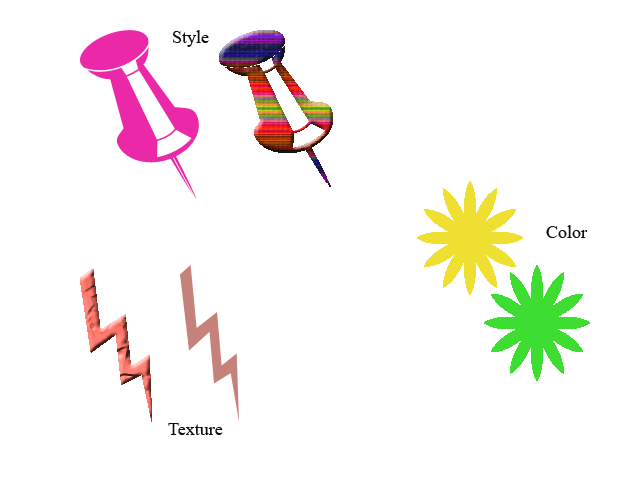
This assignment called for experimenting with color, style, and texture in Photoshop.  We could choose what shapes we wanted to experiment with.  The first element I tested was style.  I used the thumbtack shape.  The original color was a bright pink.  I then experimented with the "style" button in Photoshop and thought that the rainbow wash was a unique touch.  The next element I experimented with was color.  I started with a yellow flower and then transitioned into a bright green.  I think both colors looked appealing and exerted a playful/young feeling.  The last element was texture.  This is probably my least favorite visual out of the three.  My original lightening bolt was a light/muted pink color.  The lightening bolt after I added texture was a bit brighter and had depth.  I think that it would have looked more appealing if I had chose a different, more brighter color.  I do think that the light pink exemplifies the "texture" element well.  I am satisfied with the connotation of the visuals-they clearly represent the different elements.  Like I said previously, I am satisfied with most of the attributes such as color and presentation but some colors could have been brighter.   

Gestalt


The main idea of Gestalt is "the whole is greater than the sum of the parts."  The first principle examined is closure.  Gestalt believed that in closure, we attach meaning to visual displays.  To exemplify closure, I used the diamond shape to create what either could be one large diamond or an "x."  When you first look at the visual, it looks like 4 small, black diamonds that are arranged in a way to form one large diamond. After looking at the visual for a few seconds, the "x" begins to appear.  All of the diamonds (the whole) form an "x" which is greater than the parts.  The next principle is proximity.  Gestalt believed that we group things that are physically close to one another, in a meaningful way.  To exemplify proximity, I used the cross symbol.  I arranged the objects in straight lines in one visual and diagonal lines in the second visual.  each represent proximity, but the shapes are just arranged differently.  The third principle is similarity.  Gestalt believed that in similarity, we group similar objects together in a meaningful way.  I represented this principle by using two different star shapes.  Each shape alternated with one another, creating a pattern but are grouped together meaningfully.  The last principle is continuity.  Gestalt believed that in continuity, we look for unity in objects.  I used the heart and arrow shape to exemplify continuity.  It looks like the arrow is split by the heart, but when you look at the whole picture, the visual comes together.  Each visual was done using black and white which allowed for conformity, unity, and simplicity.  I believe that it was a good idea to keep the colors neutral to clearly display the 4 principles.  I believe that there is strong connotation throughout my visuals-everything is working toward the same goal of "the whole is greater than the sum of the parts."